


Son travail d'illustration et de conception couvre une variété de médias créatifs - des fresques murales au street art, en passant par l'illustration éditoriale, le design graphique, etc. Inspirée par la mode, la culture pop et la vie quotidienne, Emily s'efforce de créer des images accrocheuses et visuellement audacieuses avec un zeste d'humour !
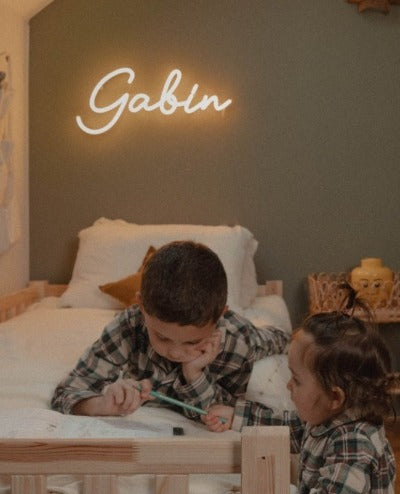
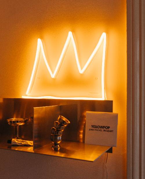
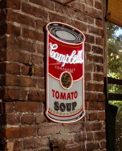
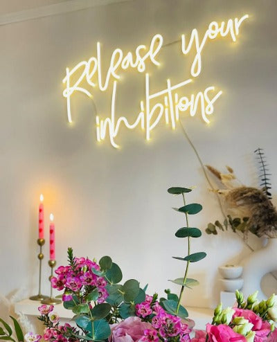
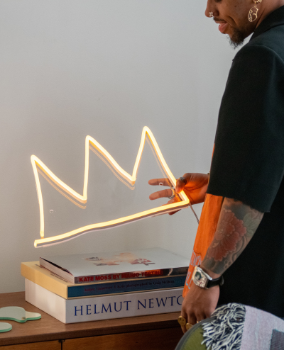
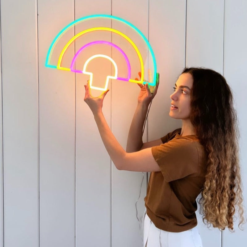
Pour Yellowpop, Emily Eldridge a réalisé une série d’esquisses - transformées ensuite en enseignes lumineuses. Place à une collection de 6 néons LED aux couleurs éclatantes !
Apprenez-en davantage sur l’artiste grâce à l'interview ci-dessous.
Peux-tu te présenter ?
Je m'appelle Emily Eldridge. Je suis originaire des États-Unis, mais j'ai vécu dans différents pays au cours des 17 dernières années ! J'ai passé 11 ans à Hong Kong, 2 ans à Barcelone, 2 ½ ans à Berlin ! Et maintenant, je suis de retour à Barcelone.
Quel est ton métier ?
Je suis illustratrice, muraliste et designer.
As-tu toujours voulu être une artiste ?
Oui ! Je dessine depuis l'âge de 3 ans. J'ai toujours été obsédée par l'art, les dessins animés, les livres et l'illustration.
Comment as-tu commencé l’art ?
J'ai étudié l'illustration au Savannah College of Art & Design, aux États-Unis. Lorsque j'ai déménagé à Hong Kong en 2005, j'ai commencé à y faire de petites expositions et, pendant mon temps libre, à travailler en tant qu'illustratrice indépendante avec des clients - ce qui m’a permis de progressivement constituer ma clientèle. En 2016, j'ai finalement décidé de quitter mon emploi à Hong Kong et de déménager à Barcelone pour effectuer un master en illustration. À Barcelone, je me suis consacrée à la peinture murale et au street art. Et j'ai commencé à obtenir de plus en plus de travail en tant que freelance. Début 2019, j'ai finalement fait le saut, et ainsi me consacrer à 100% à ma carrière en tant qu’artiste. Aujourd’hui, je crée des peintures murales, des illustrations et beaucoup d’autres oeuvres pour une multitude de clients à travers le monde.
Tu as vécu dans plusieurs villes, laquelle a une influence significative sur ton art ?
Je pense que la vie à Hong Kong a eu une grande influence sur moi. C'est un endroit où je me sens bien, toujours comme chez moi. Cette ville a tellement d'énergie, de mouvements et de vie. Les couleurs, la nourriture et la culture sont incroyables ! Il y a aussi beaucoup d'influences internationales et vous avez vraiment l'occasion d'être exposé à des personnes du monde entier, à l'art, à l’innovation, … Être entouré par ce type d'énergie est passionnant et inspirant.
Que signifie la créativité pour toi ?
C'est la capacité de m'exprimer sans mots - un langage personnel.
Peux-tu décrire ton art en 3 mots ?
Coloré, graphique et amusant !
D’où vient ton inspiration ?
Honnêtement, partout. Je regarde beaucoup Instagram, mais j'aime aussi lire des magazines, aller dans des librairies d'art, me promener en ville, voyager, faire du shopping, etc. Je suis également une grande fan du street art et des graffitis. Tout peut être source d'inspiration !
Quand es-tu la plus inspirée ?
Lorsque que je visite un musée, une galerie d’art ! Dès que je quitte ce type de lieu, j'ai généralement envie de rentrer chez moi et de peindre !
A quoi penses-tu quand tu crées ?
Haha - La vie ! Mon prochain projet ! Ou encore à ce que je vais cuisiner pour le dîner !
Quel a été ta première création ?
Je me souviens que ma mère avait un gros livre sur la façon de dessiner les chiens. Et je pense qu'à l'âge de 3 ans, je dessinais des images de ce livre, en essayant de reproduire ce que je voyais. C'est mon premier souvenir de dessin.
Avec tes dessins, quel est le message que tu essaies d'exprimer ?
J'aime exprimer les femmes d'une manière amusante et positive. Mais j'aime aussi créer des graphiques audacieux qui font sourire. Je veux créer quelque chose qui soit visuellement attrayant et excitant, quelque chose qui puisse plaire à tout le monde.
Les couleurs semblent être très importantes pour toi, pourquoi ?
L'utilisation de la couleur est aussi un langage. J'aime explorer la façon dont les couleurs s'accordent et ce qu'elles font ressentir. Une palette de couleurs vives exprime vraiment ma sensibilité.
Pourquoi dessines-tu des personnages, et surtout des femmes ?
Parce que je suis une femme (je crois !). Parfois, c'est une expression de moi-même ou de mes amies, ou un personnage fantastique qui vit dans son propre monde. Je pense que la culture moderne est tellement hyper-sexualisée avec des représentations de femmes que c'est bien de les représenter d'une manière différente et unique.
Tu dessines aussi sur les murs, pourquoi aimes-tu ça ?
Créer des peintures murales, c'est comme dessiner avec tout son corps. C'est un processus très physique, et j'adore ça. Il y a aussi quelque chose de magique à conquérir un espace, un mur ou un
bâtiment qui est tellement plus grand que vous. Créer des œuvres d'art qui sont 100 fois plus grandes que soi, c'est puissant et thérapeutique. Et puis, tout le monde peut apprécier les peintures murales !
Peux-tu décrire ton processus de création ?
Généralement, je commence par un brief du client, puis je réfléchis à la manière dont je vais l'interpréter. Je commence par esquisser des idées sur mon iPad, et une fois que j'ai réduit le nombre de croquis qui me plaisent, je commence à dessiner. C'est ainsi que je crée presque tous mes travaux d'illustration et de peinture murale. Et pour les fresques murales, je travaille de la même manière. Souvent, je dispose d'une photo du bâtiment ou des dimensions de l'espace et je travaille directement sur l'image avec mon iPad. C'est un excellent moyen pour moi de visualiser l'aspect final de la fresque.
Pourquoi as-tu choisi d’utiliser le néon comme support ?
Je pense que le néon LED est un moyen polyvalent et facile de traduire mon travail de conception en lumière. Bien que j'aime le néon traditionnel, c’est tout de même passionnant de voir que la technologie nous permette d'explorer une nouvelle façon de créer ces formes.
Pourquoi as-tu décidé de collaborer avec Yellowpop ?
C’est tellement excitant d'avoir la possibilité, en tant qu'artiste, de voir son travail sous une nouvelle forme. J'ai toujours été obsédée par les néons depuis que j'ai vécu à Hong Kong, où on en trouve partout dans la ville. Avoir la possibilité de créer mes propres motifs est un rêve devenu réalité ! Yellowpop est le partenaire idéal !
Comment as-tu pensé cette collection de néons ?
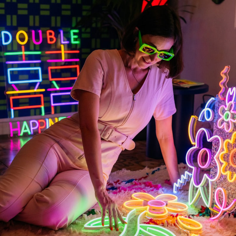
Pour cette collection, je voulais vraiment créer des pièces que les gens aimeraient avoir chez eux ; un décor moderne et funky pour des consommateurs amateurs de design. J'ai pensé à ce que j'aimerais personnellement avoir chez moi, et je suis partie de là. Bien sûr, je devais aussi inclure un hommage à mon Hong Kong bien-aimé avec le panneau "Double Happiness", ainsi que certains de mes personnages féminins !
Dis-nous en plus !
"Double Happiness" est un hommage à Hong Kong. Il s'agit d'un motif ornemental chinois fréquemment utilisé dans les célébrations et les mariages, mais que l'on retrouve aujourd'hui dans la décoration d’intérieur et la mode. Cette pièce apporte joie et prospérité à n'importe quel foyer. Les néons font également partie intégrante de la culture visuelle de Hong Kong, et j'ai donc voulu créer ma propre référence à ce sujet.
Et les néons aux motifs fleuris ?
Je pense que les fleurs constituent l'élément de décoration parfait - elles sont funky, colorées et amusantes. Et elles donnent de la vie à la maison. Un bouquet de fleurs classique peut se faner au bout de quelques jours, mais ces fleurs sont éternelles !
Et les 3 autres ?
Bien sûr, en tant qu'illustratrice, je voulais créer des pièces avec mes personnages emblématiques. Ces filles font partie de mes préférées - amusantes et colorées ! Le pouvoir des filles ! J'ai créé le néon "Shapes" pour plaire à tout le monde - quelque chose d'amusant et d'excentrique, mais pas nécessairement trop féminin ou enfantin. Je pense que cela convient parfaitement à n'importe quel espace.